
The most successful brands understand that knowing their audience and how to communicate with them is vital to their success. For better or worse, it often comes down to a simple logo. We’ve all seen our fair share of re-brandings and logo transformations. The history behind an established brand is essential and changing something familiar to the masses may alienate devoted followers. With history in hand, older brands are able to incorporate more complex and inventive logos. But nowhere is strong branding more important than in political campaigns, where there’s a limited window to make an impression before the logo fades into history. This is what decades on the campaign trail have told us about logo design.
Less is more
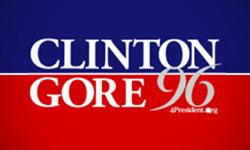
While corporate logos have many years for meaning to be absorbed by their audiences, political campaigns generally don’t last more than 24 months and because they don’t have the time to evolve, they are generally less inventive. Campaign materials often employ metaphors that are familiar and easy to understand, calling upon widely recognizable color schemes such as the red, white, and blue of the American flag. 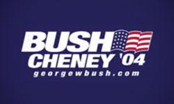 The Clinton/Gore logo and Bush Cheney logo, for example, both use bold lettering, the colors of the flag — in the case of Bush/Cheney, an actual flag logo — and the hierarchy of placing the presidential nominee’s name above their running mate’s. They’re easy to read and recognizable, which is vital for the process of becoming what is arguably the world’s most well-known brand, the President of the United States of America.
Build on what you have
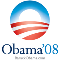
Constructing a logo for something as visible as a political campaign can be tricky. A good rule of thumb for many campaigns is to build on what you already have. President Eisenhower championed his well-known nickname in his campaign slogan, “I like Ike.” The name and rhyme was unmistakable. As a result, most people over age 30 still know the meaning of the phrase, even if they weren’t alive to experience his time in office. Then there was President Obama’s 2008 campaign logo. While it was just the first letter of his last name, “O,” it represented so much more, an empty vessel waiting to be filled with many opportunities. Sometimes the best branding is already done for you.
Trends evolve
Just as fashion trends come and go, design trends also evolve and in many cases, they’re cyclical. Design is heavily influenced by what is going on in the world. In the 1990s, when computer use and technology became ubiquitous and more complex techniques could be easily incorporated, campaign design featured more 3D features, such as drop shadows and beveling. That look has all but disappeared by now and present day campaign logos — flat design with basic imagery — have more in common with advertising styles from the 1960s and early 70s than recent design trends. At every point, collective consciousness is reflected in design, and whether a brand is viewed as forward thinking or conservative depends largely on how it relates to the prevailing trends.
Being original can work… sometimes
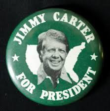
In recent decades of presidential campaign logos, there is only one true outlier — Jimmy Carter. As the country was still recovering from Vietnam, Watergate, and the first ever resignation of a U.S. president, Carter wanted to communicate that he was a different kind of candidate: One who would care for the people of Main Street. To match that message, he opted against using the patriotic trio of red, white, and blue in favor of green, resembling the familiar look of a street sign in your hometown. While the unique color scheme accompanied Carter to his victory in the 1976 presidential election, he lost heavily in his bid for re-election, falling to Ronald Reagan in 1980. Whether it was due solely to his green branding is up for debate.
Does public opinion matter?
Public opinion plays an interesting role in design. When an older brand freshens up its identity or a new company enters the public eye, everyone becomes a critic. Without knowing a design’s context or the solutions a particular logo offers, people tend to evaluate an abstract symbol without enough context. Even the now iconic Nike Swoosh received criticism from its earliest reviewers. Company founder Phil Knight himself was resigned to the hope that “maybe it will grow on me.” Experienced designers are more inclined to refrain from quick commentary and instead prefer to observe how a logo helps develop the overall brand. 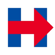 Hillary Clinton’s campaign strategically hired top designers, and but having the best people work on your brand is not necessarily a way to avoid criticism. Clinton’s logo has been called distant, cold, and non-inviting. However, it’s also been hailed as original and versatile. Despite early criticism, the design has proven to be highly successful. It’s not overly branded and the letter “H” is easily identifiable. Over time, its strength has shone through as a smart design that’s flexible and memorable. The mark can be enlarged by adding “Clinton” and “Kaine,” but it can also be reduced to 16 pixels without losing its identity, which is necessary considering the advent of social media and small mobile screens. The takeaway? When evaluating creative design, context is everything.
 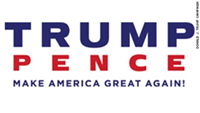 While most brands ride out criticism, others give in. When Donald Trump announced his running mate Mike Pence, the campaign released a logo that added Pence to the ticket. Public outcry influenced a change and the logo is now a more traditional look that includes both their names and the nominee’s now famous catchphrase. In the end, despite design trends being cyclical in nature, branding that is bold and open to interpretation tends to be the most successful. Smart designers need to think strategically about the problems to be solved and the audience to be reached. When it comes down to it, simplicity reigns supreme. Logos, brands, and political design work best when they speak a language that people can understand.
Shawn Cheris


Read Next

15 Best New Fonts, May 2023

10+ Best Tools & Resources for Web Designers and Agencies (2023 updated)

20 Best New Websites, May 2023

How to Find the Right White Label Website Builder for Your Agency

Exciting New Tools For Designers, May 2023

3 Essential Design Trends, May 2023

10 Best AI Tools for Web Designers (2023)

10 Best Marketing Agency Websites (Examples, Inspo, and Templates!)

15 Best New Fonts, April 2023

20 Best New Websites, April 2023

Exciting New Tools For Designers, April 2023
