

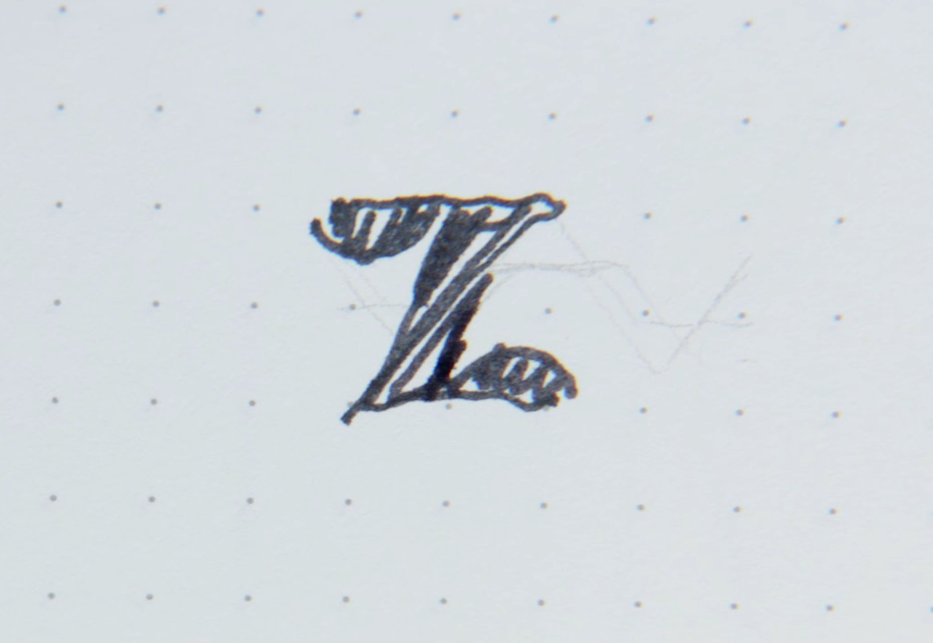
We’re all familiar with the old Zendesk logo, right? The memorable image of the Buddha who’s wearing a headset (melding old-fashioned mindfulness with modern-day tech) was an instantly recognizable logo of a big brand in today’s tech industry. ![]() Now, the new Zendesk logo is a combination mark of a logotype or wordmark design together with an iconic or symbolic logo while the old one with the Buddha was your classic iconic or symbolic logo. The new logo is essentially the “Z” in Zendesk that’s compiled of different pieces to form the letter, with the word “Zendesk” underneath it as sort of its foundation.
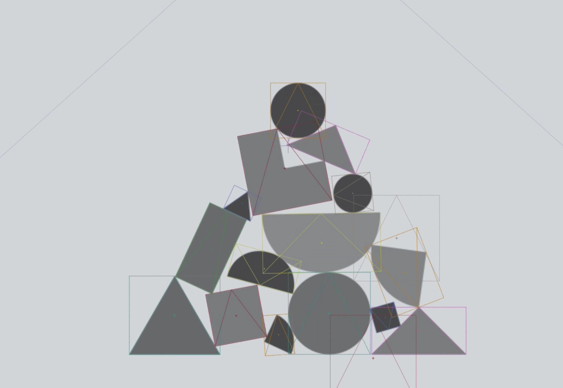
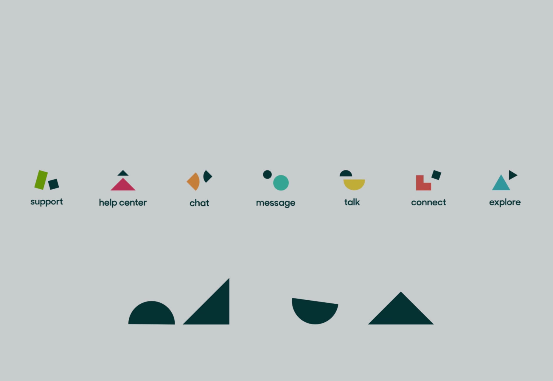
Now, the new Zendesk logo is a combination mark of a logotype or wordmark design together with an iconic or symbolic logo while the old one with the Buddha was your classic iconic or symbolic logo. The new logo is essentially the “Z” in Zendesk that’s compiled of different pieces to form the letter, with the word “Zendesk” underneath it as sort of its foundation. ![]() [pullquote]The new logo is a representation of various parts of Zendesk’s business.[/pullquote] The reason for the change in Zendesk’s logo has to do with where this brand and company have come since the earlier days of its inception. When the old Buddha logo was designed, it was to commemorate its startup roots and the fact that Zendesk was being built to do something cool (hence its fun colors and humorous Buddha logo!). In hindsight, the use of the Buddha in the logo turned out to be limiting, according to Toke Nygaard, Zendesk’s Chief Creative Officer. While the logo never really offended anyone in a serious way, it turned out to be restrictive from a pure standpoint of marketing and creativity. After all, Zendesk never had plans to actually animate its former Buddha logo and do more with it, such as storytelling, for concern that that direction would offend some people. In addition, the use of a cartoon Buddha was also limiting since that was a stylistic restriction. The new logo is a representation of various parts of Zendesk’s business. Here’s how Zendesk is describing these various parts of the logo: The small triangle on top of the bigger one stands for Zendesk’s analytics engine named Explore. The company’s Help Center is represented by two arrows, with one leading the other. Finally, Zendeks’s Support is shown by the tall rectangle that leans into the short square. Alone, these shapes for each distinct Zendesk business have their own animated “personalities,” but together, they assemble into Zendesk’s new logo. The new design of the logo is inspired by the Danish roots of Zendesk, in addition to Nygaard’s own childhood in Denmark. More specifically, the Zendesk redesign was inspired by the simplicity and basicness of toy blocks along with the works of Danish legends. For example, the wood monkey from Kay Bojesen, Arne Jacobsen’s textile prints, and Poul Kjarholm’s puzzle-piece EKC logo. The Zendesk team were greatly helped by going back and looking at these traditional Dutch masters concentrated on keeping things simple, reducing the design to its bare essentials, and also working with shapes.
[pullquote]The new logo is a representation of various parts of Zendesk’s business.[/pullquote] The reason for the change in Zendesk’s logo has to do with where this brand and company have come since the earlier days of its inception. When the old Buddha logo was designed, it was to commemorate its startup roots and the fact that Zendesk was being built to do something cool (hence its fun colors and humorous Buddha logo!). In hindsight, the use of the Buddha in the logo turned out to be limiting, according to Toke Nygaard, Zendesk’s Chief Creative Officer. While the logo never really offended anyone in a serious way, it turned out to be restrictive from a pure standpoint of marketing and creativity. After all, Zendesk never had plans to actually animate its former Buddha logo and do more with it, such as storytelling, for concern that that direction would offend some people. In addition, the use of a cartoon Buddha was also limiting since that was a stylistic restriction. The new logo is a representation of various parts of Zendesk’s business. Here’s how Zendesk is describing these various parts of the logo: The small triangle on top of the bigger one stands for Zendesk’s analytics engine named Explore. The company’s Help Center is represented by two arrows, with one leading the other. Finally, Zendeks’s Support is shown by the tall rectangle that leans into the short square. Alone, these shapes for each distinct Zendesk business have their own animated “personalities,” but together, they assemble into Zendesk’s new logo. The new design of the logo is inspired by the Danish roots of Zendesk, in addition to Nygaard’s own childhood in Denmark. More specifically, the Zendesk redesign was inspired by the simplicity and basicness of toy blocks along with the works of Danish legends. For example, the wood monkey from Kay Bojesen, Arne Jacobsen’s textile prints, and Poul Kjarholm’s puzzle-piece EKC logo. The Zendesk team were greatly helped by going back and looking at these traditional Dutch masters concentrated on keeping things simple, reducing the design to its bare essentials, and also working with shapes. 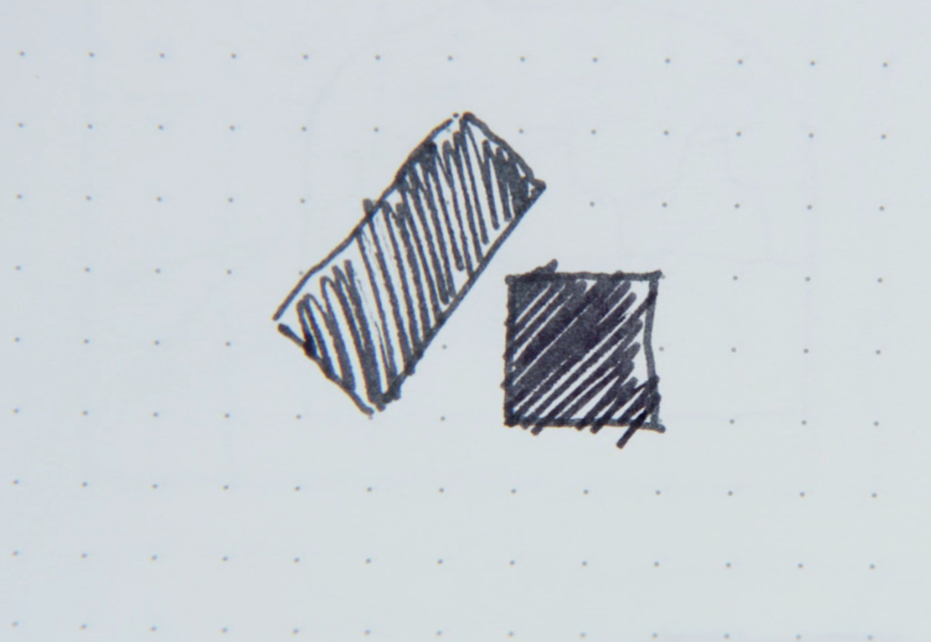
 The end result is a form of visual clarity and tastefulness with a modern twist, all firmly rooted in a very Dutch identity to communicate a looser feeling of Zen. Some would therefore argue that this new logo is more befitting of a serious tech company instead of the cartoonish Buddha character of old. Here’s a short video about the journey to design their new identity:
Marc Schenker


Read Next

15 Best New Fonts, May 2023

10+ Best Tools & Resources for Web Designers and Agencies (2023 updated)

20 Best New Websites, May 2023

How to Find the Right White Label Website Builder for Your Agency

Exciting New Tools For Designers, May 2023

3 Essential Design Trends, May 2023

10 Best AI Tools for Web Designers (2023)

10 Best Marketing Agency Websites (Examples, Inspo, and Templates!)

15 Best New Fonts, April 2023

20 Best New Websites, April 2023

Exciting New Tools For Designers, April 2023
